

The Power of Consistency: Choosing Paper for Cohesive Marketing
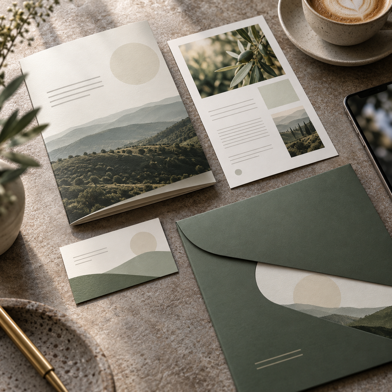
Marketing materials rarely travel alone. Brochures, flyers, cards, and folders work as a set, so the paper decision is about choosing coordinated weights and finishes that feel consistent across every piece while suiting each one’s job. Here’s what to reach for and why.
Recommended Paper Characteristics
- A smooth text weight as your everyday workhorse: the versatile base for flyers, sheets, and brochure bodies. Bright white and smooth keeps color and type sharp across the whole set and prints economically in volume.
- A matching cover weight for cards, folders, and covers: using a cover weight from the same family as your text stock keeps the set visually cohesive while giving durable pieces the substance they need.
- A textured or premium sheet for hero pieces: a felt or linen finish on a signature brochure or leave-behind adds a tactile, premium accent that makes the whole set feel more considered.
- A consistent shade across the suite: keeping one white or natural shade throughout means every piece reads as one brand rather than a mismatched collection.
Finish, in One Line
- One family, mixed weights: pair a text weight and a cover weight from the same look so pieces feel related.
- Smooth for volume, textured for heroes: smooth stock for everyday runs, a textured finish where you want impact.
- Lock the shade: commit to one white or natural tone across the set for a cohesive identity.
Ready to Build a Cohesive Set?
Coordinated paper is what makes a marketing set feel like one brand. Explore the full selection at defypaper.com, where you can pair text and cover weights in matching shades and finishes, then start designing. When you’ve printed something you’re proud of, share it with us. We love seeing what our paper helps create.